Can I produce a good-enough chart from a prompt?
That was the whole question behind this experiment. To find out, I asked my Hermes agent on Telegram to install the Datawrapper MCP for me.
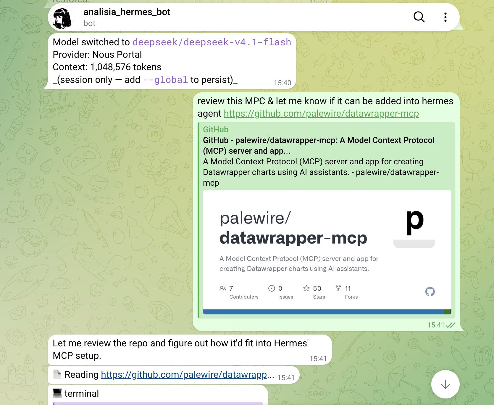
A few messages later, it was done — and the agent could create charts in my own Datawrapper account.
The data I used
I needed something real to test with. So I dumped Meta ads data from one of the brands I helped in the past — a campaign set with ad spend north of $1 million.
What I actually wanted to know
The goal was simple. How quickly and how well can an AI agent answer my hypotheses and business questions, and turn them into charts I’d be happy to publish?
So I gave it five.
1. Where did the budget actually go?
First, a descriptive one: spend by campaign objective. I handed over the CSV and asked.
The result was pretty good — call it 90% ready. I made a few revisions on colour and chart notes, and that was it. The chart lives in my Datawrapper account, so I can edit it any time.
2. Younger audiences should be cheaper
My hypothesis: younger audiences are cheaper, because they have less money and often no job yet. Older audiences are more expensive, because they have jobs, higher income and greater purchasing power.
Verdict: true. CPM — the cost per 1,000 impressions — climbs steadily as the age band grows.
3. Gender shouldn’t change the price
My hypothesis: gender doesn’t affect the price Meta charges advertisers.
Verdict: also true. Across every campaign objective, there’s no meaningful CPM difference between male and female audiences.
4. Younger audiences click less?
My hypothesis: younger audiences will have a lower click-through rate, because they’re more tech-savvy and less likely to tap an ad. Older audiences, less so.
Verdict: looks true. CTR rises with age — 45–54 clicks at 1.78% against 1.19% for 25–34, and the 55–64 band nearly doubles that again at 4.01%, roughly ten times the youngest cohort.
5. December is expensive
My hypothesis: in high season — Christmas, the shopping period — prices go up.
Verdict: true, and dramatically so. CPM in December runs roughly 4× a normal month.
Why I keep using CPM
You’ll notice CPM shows up in almost every chart here. That’s deliberate: cost per thousand impressions is the buying model Meta uses to charge advertisers. Google Ads works differently — it charges per click, or per view for YouTube campaigns. Same question, different unit of measurement.
So — how was it?
Honestly? Analysing data and generating charts through an AI chatbox is a much more convenient way to work.
Two rough edges:
- Latency. Each prompt took a couple of minutes to come back with a result. Not a big deal, and it’ll improve as we get better LLM providers — ChatGPT Astra, I’m looking at you. 😄
- Not a 100% match. The chart you get won’t be exactly what you had in mind. Close enough, though — it needed a small tweak, not a rebuild.
That’s the trade-off, and it’s a good one. I think this is going to be my workflow for non-recurring chart building, the occasional blog post, and ad-hoc analysis requests from clients.
Cheers.
Get the weekly performance digest
Weekly marketing insights from the Analisia team, straight to your inbox.